Card Payment Brick
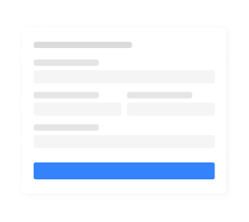
Card Payment Brick offers a payment form with an optimized design and different themes, providing all the necessary fields to make a payment with a credit and/or debit card, and includes the necessary mechanisms to automatically receive the necessary data to create the payment in the back end.
This Brick, in addition to containing the fields to collect the personal data of the cardholder (name of the cardholder and ID), also has fields to collect the card number, the expiration date and the security code (CVV), which already comply with PCI security standards, eliminating the need to process this data.
In addition to collecting the necessary fields to make the payment, this component also helps the user to complete the screen with alerts for incomplete fields and possible input errors. See below the main features of this Brick.
Try our Brick
Build visual experiences in real time. When you are ready, download or copy the generated code to add to your website or share with a developer.

Layout
The Card Payment Brick layout is based on the best UX practices, so that it is possible to offer the best shopping experience without having to worry about design details. The layout offers the elements detailed below.

| Element | Characteristics | Comments |
| Accepted title and flags Property: formTitle | Value (title): Credit or debit card Label: N/A Placeholder: N/A Type: text/image Format: N/A Max. characters: N/A | Optional Customizable *Flags are displayed along with the title. The only customization available for them is to hide them along with the form title, no longer displaying that information. |
| Card number input field Property: cardNumber | Value: N/A Label: Card number Placeholder: 1234 1234 1234 1234 Type: number Format: N/A Max. characters: depending on the issuer it can vary between 15 and 16. | Mandatory customizable (label, placeholder) |
| Card expiration date input field Property: expirationDate | Value: N/A Label: expiration date Placeholder: MM/AA Type: date Format: MM/AA Max. characters: 5 | Mandatory customizable (label, placeholder) |
| Security code input field Property: securityCode | Value: N/A Label: Security code Placeholder: 1234 Type: integer Format: N/A Max. characters: 4 | Mandatory customizable (label, placeholder and maximum of wrong characters) |
| Card cardholder name input field Property: cardholderName | Value: N/A Label: Name of the holder as it appears on the card Placeholder: João Silva Type: string Format: N/A Max. characters: 100 | Mandatory customizable (label, placeholder, type, format and maximum of wrong characters.) |
| Cardholder ID selection field Property: cardholderIdentificationType | Value: Label: ID Placeholder: N/A Type: select Format: N/A Max. characters: N/A | Mandatory customizable (label, placeholder) *If the document type and number data were previously provided and saved, this element becomes optional. |
| Cardholder ID number input field Property: cardholderIdentificationNumber | Value: N/A Label: N/A Placeholder: N/A. Type: number Format: N/A Max. characters: N/A | Mandatory non customizable (label, placeholder) |
| Buyer’s email input field Property: email | Value: N/A Label: Email Placeholder: joaosilva@email.com Type: string Formato: conventional email format (example@email.com) Max. characters: X | Mandatory customizable (label, placeholder) *If the data was previously provided and saved, this element becomes optional. |
| Payment button Property: formSubmit | Value: [imagen] Pay Label: N/A Placeholder: N/A Type: text callback: onSubmit function: promise(cardFormData) | Optional Concealable and customizable *The function receives the data from the form, including the card token, and presents a loading animation. |
